#Word Tutorial
Explore tagged Tumblr posts
Visit Tumblr Blog
Explore Tumblr blogs with no restrictions, modern design and the best experience.
Last Seen Tumblr Blogs


Fun Fact
Tumblr has a 66 index score for customer satisfaction in the US.
Text
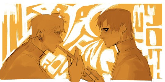
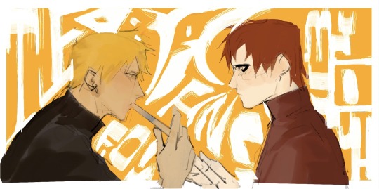
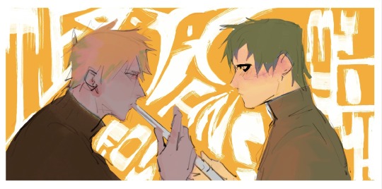
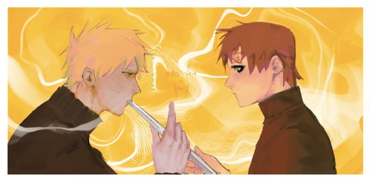
Needle Felt Siffrin Build Log: (oct 6 - nov 20, 2024)


Credits goes wholely to @insertdisc5 for creating ISAT and siffrin's design! I am just here to attempt to make cool fanart (and get more people to play isat.. my devious plans are going great so far :3) As always, this isn't a tutorial- it is just a log about how i go about approaching a sculpture and I hope this collection of resources can help others make their own sifs!!
PSA: this has some spoilers for endgame CGs/sprites on my references image board ( also might see it in the backgrounds of my process pics). And bc this is needle felting, you will see some sharp needles! beware!
my inspiration was the intro cutscene where Sif eats the star, so my main goal was to adhere to the style of ISAT as closely as possible while transfering it to 3D space. And I knew i also wanted to try making the cloak for stopmotion purposes, so my process was tailored towards having control over the fabric with wire inlaid within the cloak (more on that later).
I ended up not sticking eyebrows on top of siffrin's bangs lol but anyways, first order of business is Gather Reference! v important. pureref is free and an awesome program. I also do some sketches to visualize the pose and important details i wanted to include in the sculpt.
behold the isat wiki gallery page! tawnysoup wrote an awesome ISAT style guide that absolutely rings true in 3d space too!! adrienne made a sif hair guide here!! (sorry i couldnt find the original link, but it's on the wiki). It says ref komaeda hair so that's what i looked at, along with other adjacent hairstyles! I also like doing drawovers on in progress photos to previs shapes n stuff to get a better idea of the end result.
Also if you're like me and struggle with translating stuff into 3D space, take a look at how people make 3d models and figurines! sketchfab is also a great resource! I looked at the link botw model by Christoph Schoch here for hair ref. (I used Maya, but there's a blender version too ! you can pose characters too if your model has been rigged!)


Face:
Started off blocking out the main shapes of eyelids and iris, and then filling in the colour details in the iris and the star highlights before moving onto adding thin black outlines and eyelashes. I didn't take many in-progress photos cause i kept ripping stuff out to redo them many many times, sorry!! This eye took about 3 hrs bc i just wasn't happy with it!! Sometimes it do be the vibe to give up, go to bed and see how it looks in the morning (more often than naught, it looks fine and it was the "dont trust yourself after 9pm" speaking)
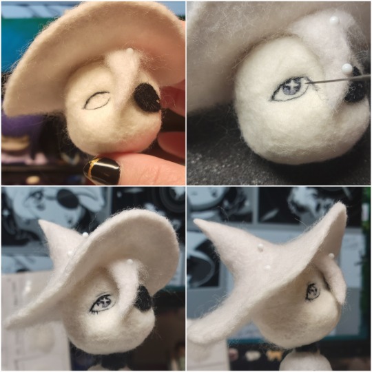
The Mouth:
Couldn't decide if i even wanted to add a mouth as per usual with all my humanoid sculptures.. but i did some drawover tests first to see what expression i liked and to try to visualize it from multiple angles. (I was also testing the placement of stars on the hat brim here)

And then I redid the mouth like 3 times cause the angle just wasn't right (this went on for about the course of a week yay!)
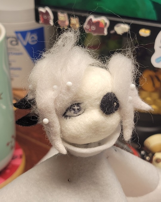
Hair: woe baldfrin be upon ye
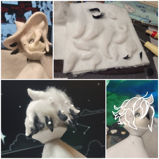
I made the hair strands individually first, and then since Sif has some of the hair at the back dyed black, i covered some of the tips with black wool (manually) (I think it would go much faster if i just took a marker to it, but hahaha i love pain and detailing!! )
And then the rest of it was positioning strands with sewing pins layer by layer, always looking at it from different multiple angles- sometimes tailoring the angle or swoop of individual hair flippies. At one point I thought the back looked too cluttered, but the hat covers a lot of it anyways!! yay for hiding mistakes! (imo this is a similar process to how cosplayers style wigs, but on a smaller scale and the same level of time consuming)
As always, look to your reference for guides, and I always do a whole bunch of drawovers over in progress photos to ascertain what was working and what wasn't.
Hat:
A trick to get a super pointy tip, make another tip seperately while keeping the connection point unfelted, and then combine the two to make super pointy hat!! (this also helps if you made the hat too short and need it to be taller. ask me how i know)

The embroidery on the hat brim was done in a hoop and then invisible stitched to the felted top portion. Technically you don't need a hoop but it helps keep the fabric tension, so you avoid puckers in your embroidery. You can also use iron-on stabilizer if your fabric is loose weave or particularly thin. this is the tutorial i used for the stars embroidery! particularly the fly stitch one, french knots, and the criss-cross stitches. highly recommend needlenthread for embroidery stitches and techniques! i learned all my embroidery from this single site alone.
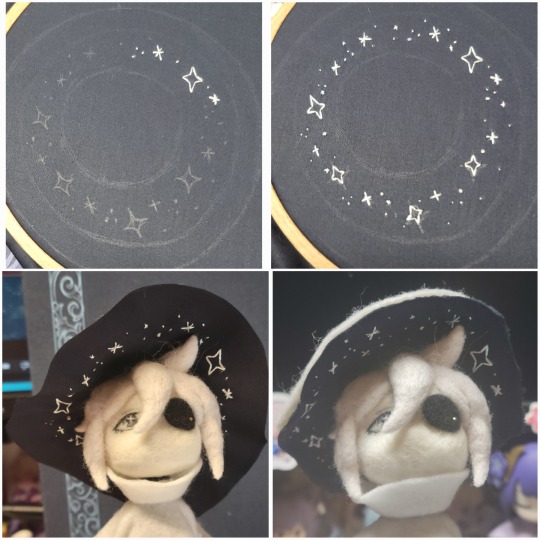
For fabric, I think I used a polycotton i had in my stash,, unsure of the actual fiber content bc i bought it a long time ago. I used DMC Satin floss which was nice and subtle shiny but frayed a lot so it was kind of a pain to stitch with... but keep a short thread length and perservere through it!! After the embroidery was done, I folded up the raw edges and invisible sewed it to the top portion of the hat.
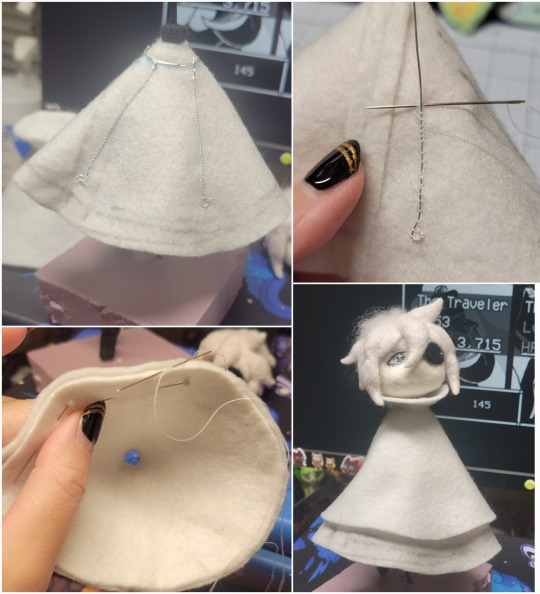
General shape:
Ok general structure of the body is this: wire armature body covered with black wool -> cloak lining & wire cage -> edge of lining is invisibly sewn to the main cloak at the hem -> head

Don't be afraid to mess around with the pattern, it's essentially a pizza with a slice taken out of it to form a steep cone shape!! Use draft paper before cutting into felt to save material! (i think i made like 3 cloaks before i was happy with the shape lol).
You can also hide the seam of the cloak and collars by gently messing up the fibers of the felt with your fingers or a felting needle btw! you can also sandpaper the seams according to Sarah Spaceman in this vid (highly recommend them for their in depth cosplay/crafting builds holy smokes), though since sif cloak is at such a smol scale, I just blended the seam with my felting needle.
For the lining wire cage section, I sewed in wire around the cloak, so the main rotation point is at the top neck area under the collar. These paddles are used to keep whatever pose I need the cloak to be in for stopmotion purposes. Then after the wire is done, I invisibly sewed the lining to the cloak at the hem (same technique as the hat brim to the lining there).
In hindsight, I should've used a thinner fabric for the lining, but i only had sheer white in my stash so had to go with double felt, thus resulting in a really bulky lining but oh well!
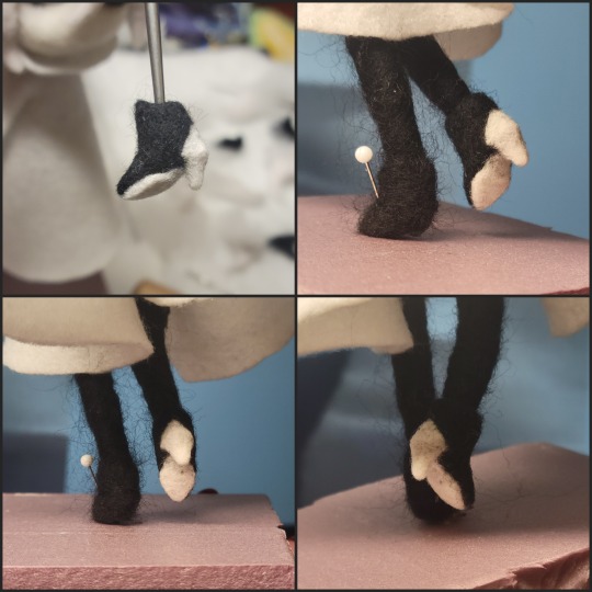
Heels:
started with the general boot shape, then tacking on the diamond shape heel stack and also diamond shape sole bc we're committed to the bit here. I skewer the boot onto the armature which also conveniently hides the connection point into the base to keep the whole thing upright and also I can rotate the boot to tweak the angle if needed.
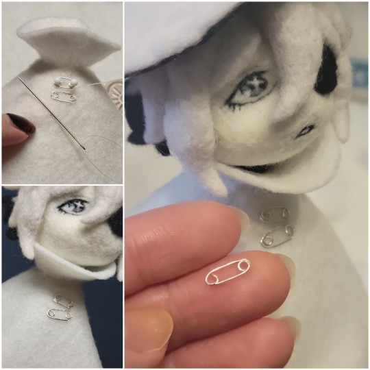
Pins:
I kinda just trial and error'd jewellery wire with pliers into the pin shapes. They're itty bitty!! had a whole bunch of fails before i got two nice ones. A hot tip is to use needle nose pliers and wrap the wire around the tip to get a smooth circle shape!
Base:
I smoothed out the edge of a circular wood base with a dremel, and then used wood stainer to get the black colour. It ended up kinda looking like I took a sharpie to it, but whatever.... now i have a whole ass can of black wood stainer........ I then made a rough mountain of black wool and stuck the feet armature in. And now he's standing!!
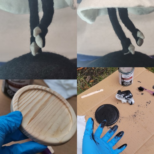
Normally at this point when I'm done felting everything, to get a smooth finish, I'd take a small pair of scissors and carefully snip away any flyaway fibers, but this time, I just left them fluffy cause i think that's what sif would do :3c
Photoshoot:
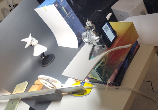
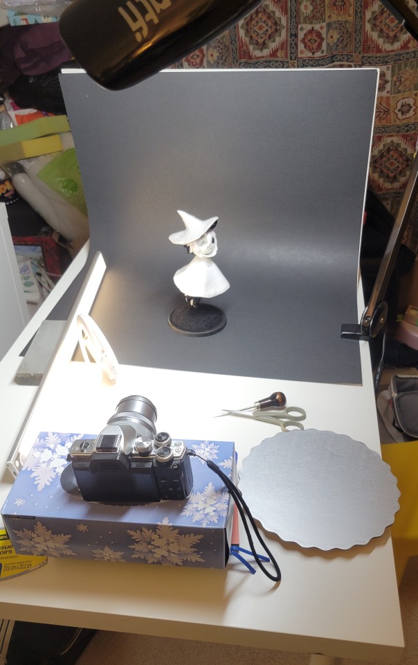
Normally I do shoots using daylight but it was winter so the sun was nonexistent. So I broke out the home lighting setup aka dollarstore posterboard for a nice smooth background, and then hit it with the overhead Fill, side Fill 2, and Rim light, and use white paper/posterboard for bounce light if one side feels too dark. But if things are overexposed, you can move the light sources away until the harshness dims down. I'm using a Olympus mirrorless camera (handed down to me by my sibling so i dont remember the model exactly), which can connect to my phone as a remote so I can avoid shaking the camera when i take photos. Pretty nifty for stopmotion purposes! (yes my camera stand is a stack of notebooks, a tissuebox and some eva foam under the lens, don't judge me)
Stopmotion animation:
I'm still figuring stopmo out on my part, but my process was straight ahead animation ... move the cloak a cm, take a pic.... move another cm, click.... and repeat until i get a version I was happy with. My ref was the cloak animation from Gris (beautiful game btw). The 2d star animation was also done straight ahead using procreate, exported in png with a transparent background, and finally stitched together with the stopmotion footage in photoshop.

My turnarounds are also stopmotion! also secret hack, the turntable is a fidget spinner sticky tacked to a cake platter.
And i think that's all! i mainly wanted to share how I go about thinking about taking a 2d concept and moving it to 3D. I also didn't go in depth into how to actually do the needle felting bc I don't think I''d be very helpful I'm a very good teacher by telling yall to just keep stabbing until it looks right (i'm self taught for this hobby),,, if anyone wants it though, i can share a bunch of tutorials and other felters' process that helped me learn more needle felting!
Hopefully this was helpful to someone! Feel free to send asks if ya got any questions or if anything needs clarification! Or show me your works! I love seeing other people's crafts :3
here have a cookie for making it this far 🥐
#in stars and time#siffrin#isat#isat siffrin#isat fanart#needle felt#soft sculpture#know that i am devouring all the nice words yall leave in the tags/comments of my posts :holding back tears:#I hesitate to call this a tutorial bc this is just how i fumble my way through crafting anything lmao#the only reason I know how long I worked on a project are timestamps on wip photos and however long the day's video essay or letsplay is#sorry time is immaterial when i get into crafting mode#reason why this log is so late is bc after i finish a project i'm perpetually hit with the ray of 'i dont ever want to look at this again'#hence why photos never get edited#AND THIS POST SAT IN MY DRAFTS FOR 2 MONTHS DUE TO BLOODBORNE BRAINROT SORRY#done is better than perfect!!!#sorry i dont control the braincell#sorry for using a million exclaimation points! i am not good at this.. conveying my anxiety in written form!!! my toxic trait
1K notes
·
View notes
Text
Managing Track Changes in Microsoft Word|Section 508 for Word
Learn how to manage Track Changes in Word for Section 508 compliance, ensuring your documents are accessible and professional. #TrackChanges, #MicrosoftWord, #Section508, #Accessibility, #WordTips, #DocumentEditing, #InclusiveDesign, #AssistiveTech
Welcome to another post in our series on enhancing Word accessibility to ensure Section 508 compliance. Today, we explore how to manage Track Changes effectively. This feature, while incredibly useful for document collaboration and editing, needs special attention to ensure Word accessibility. Video Guide Understanding Track Changes in Word Track Changes is a powerful tool in Word that allows…
View On WordPress
#Accessibility Compliance#Assistive technology#Document Accessibility#Editing Tips#microsoft word#section 508#Track Changes#Word Tutorial
0 notes
Note
Hi! Absolutely adore your work 💗 I’m not sure if you’ve gotten a question like this before, so feel free to ignore, but do you have any tips for capturing likeness of characters you draw? You manage to stylize characters, especially live action characters, just right!


Thank you <3
#anon ask#ask box#to be deleted later#personal#my art#please don't repost#tutorial#reference#art resources#artists on tumblr#i tried very hard to explain how i do it but im not a good teacher and it shows#don't listen a word i say#gosh i suck at this#thank you for your lovely words#sarah michelle gellar#christopher plummer#lionel astier#daniel davis#robert downey jr
549 notes
·
View notes
Text
In the light of googledocs being little shits, here it is again.
In the light of many people using tumblr to write because of aesthetic reasons, and losing their fics/poems/posts because tumblr is a little shit, here is:
How to change paper colour in Word, font colour, and get rid of the gray area (as much as possible) in the background.
(bonuses: font size, how to hide/unhide the stuff at the top)
Or, how to go from this

To this.
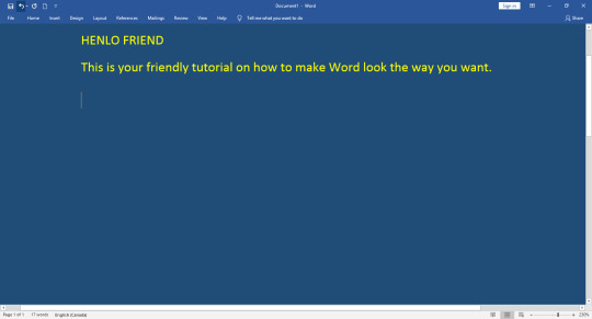
The post looks daunting, but it’s super user friendly, and once you know your way around those tricks, it takes a few clicks and you’re good to go. Yay!
Keep reading
#googledocs#something with AI#gleaning all your work that's sitting there#it's a google labs thing#tutorial#word tutorial
43 notes
·
View notes
Text
The magnus archives when everything’s the same but the action happens 10 years into the future (starts 2026) and the institute is under scrutiny because some gossip magazines accused them of having misogynistic management because the Head of the Institute was always a man so Jonah Magnus originally born in the 1700s decides to deal with that by his next body being a woman so now he has to deal with periods and gender dysphoria
#what am I even writing at this point#this is just words#the magnus archives#tma podcast#tma#jonah magnus#elias bouchard#he regrets his choices pretty quickly but can’t#the institute starts paying for their workers gender reassignment surgery#jonah gains a new respect for trans people#tutorial on how to make a Gregorian era man more progressive: make him trans for a decade#my tma aus
468 notes
·
View notes
Note
do you have any advice on drawing slugcats/scavs? i love how you draw both... sincerely...
i'm rising from the dead just to answer this one even though i'm not much of an adviser or a tutorial guy x) my style is not consistent and i just flow with most of things
but here's some tutorial-ish things

slugcats are just...blobs at this point in my style, i don't use many additional lines or smth for them
it's like this one "how to draw a rat" meme where there's only two steps: "draw any shape" "done"
scavengers are more complicated tho!

they have actual anatomy and as stated - i'm still figuring it out x) but at least it's fun
here's some other scavs i drew for a little example - a random one and kinda an OC of mine

i hope this helps even if just a little bit, i really have no idea how to explain my drawing process or give drawing advice :")
#nickeeart#askers: txt#tutorial#uhhh don't wanna put it in the main tag but fine i guess#rain world#i haven't drawn in a while so this might look just a little ugly#oh and thank you for the kind words<3
585 notes
·
View notes
Text
here's some punk diy tips and ideas
[other than crusty pants and battle jacket, although we still love those greatly.]
why should you diy, when you can just find decorated items everywhere, you can ask. what if you are clumsy at painting or anything?
firstly, good questions. we diy so we don't give credit to the big companies who rule the world. we diy to get more independent from the system we dislike. we diy so to save money. to express uniqueness, recognize eachother and be recognized. and especially to have fun and feel cool. diy is not only about clothing, but anything you can set your mind on. of course, one cannot make EVERYTHING for themselves, there isn't enough time and energy. but making at least small steps are already a statement and more than nothing. also, helping small artists by buying their products is also pretty punk.
that being said, i provide you with some tips of mine, all gained from experience:
anything you drew/painted on, you will WANT TO protect. acrylic paint/markers + acrylic paint varnish/transparent nail polish/textile medium are your best friends. read after anything that's new to you.
i highly recommend working with old clothing or thrift shop finds when it comes to textiles, as it is environmentally friendly and you will stay in budget. Anyways, always make sure that the material you use isn't gonna be problematic. for example, if you want to do some patchwork, the material shouldn't decay easily (if it does, it will come off so quickly.). if you want to paint on it, it shouldn't be rugged.
you can not only draw/paint on your canvas shoes, but can also sew, embroidery (just make sure to use a thimble, plus floss instead of thread could make your work more durable), and add beads and trinkets to your shoelaces. in the case of shoes, never use glue (neither hot nor instant glue) – it will come off quickly. for some inspiration, i'll show you my shoes!
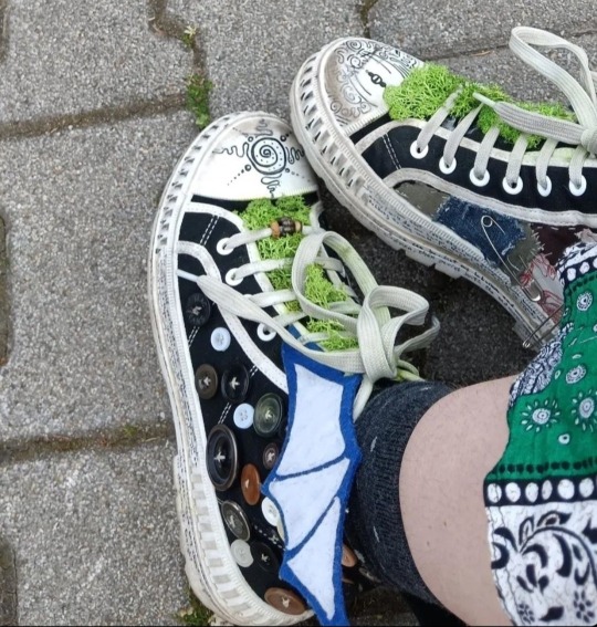
(the fake moss is literally unstoppable from falling off or getting dirty. risky idea.)
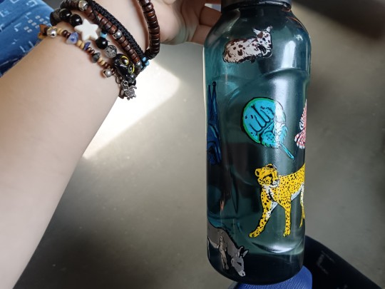
it's good to carry around water and food!! you don't even have to pay for decorative water bottles and food boxes, as you can draw on glass and plastic just fine with acrylic markers. just don't forget to paint transparent nail polish all over your drawing. in at least two layers. don't be lazy or laid-back. even posca comes off while washing the dishes. and you WANT TO save your reference pictures/final designs, as the case of emergency is likely. but after all, my water bottle is exactly fine after six months, with no accuring problem.
if your current best option to get stickers from is aliexpress or overpriced decor stores, search for local artists and shops on instagram and tiktok, as it may be their most efficent way of getting you to know them. if it seems like you have no chance, you may can still find a print shop with the option of printing on self-adhesive sheets (at least in hungary, those are pretty cheap). and if you want drawings to print out as stickers, you may use your own or –ONLY IF YOU GET PERMISSION– other artist's work. not only good for decorations for like, headphones, but for vandalism too. WAIT WAIT who said that. who said it. not me. no never
(in case that's also impossible, you can create stickers by printing out/drawing a picture, cover it up in transparent adhesive tape, and then put some two-sided adhesive tape on the white side of the pic. it won't be that durable, but it functions.)
if you want to bleach-paint clothing, get some plastic brushes!! any other brush dissolves. draw your design first with chalk!! never forget to put cardboard inside the clothing, and to wash the finished work in a washing machine before you'd put it on. prepare to be patient with the process. and it's not dangerous to touch 5%-9% household bleach, just wash your hands soon after.
if you want your crusty pants to last veryyy long, wax them. look up on youtube jeans waxing.
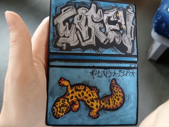
some more things i made for myself so to give you some inspiration: totebag with pockets, a small crystal holder cabinet, badges, and i decorated some t-shirts, button-ups, an id card case, phonecase, laptop.
theoretically speaking, there is nothing that an individual would be unable to learn how to make, when it comes to diy. you can't imagine how easy it is to bake bread at home. consuming-focused media makes people believe that it's hard to make anything. of course, everyone has to decide about their own priorities, i don't want to convince or change anyone in here. and if you have any questions, send an ask!! i hope i had been helpful.
#punk diy#tips#tutorial#clothes painting#do it yourself#bleaching#alternative clothing#soren's hoard of words#i hope you'll have fun with this#stay safe and drink water
218 notes
·
View notes
Note
The way you color is absolutely phenomenal! Looking at your latest Naruto piece I’m just absolutely astonished by how the colors all work together. If you could give any recommendations for tutorials for a fellow artist I’d so appreciate it!
Keep up the amazing work 💕
~pudding 🍮
Wow, thank you so much!!! That’s so kind! I’m very happy you like it! To be entirely honest I’m still learning how to colour—a lot of what my process is right now for colouring is just… vibes. I play around with it until my brain is like ‘I like this’, and I haven’t really watched many tutorials for colouring (I should…) so my best point of reference is to see how an artist you likes does colour and experiment on your own canvas to see how they achieve that. Studying and experimenting is a huge part of the learning process, and finding what works for you specifically.
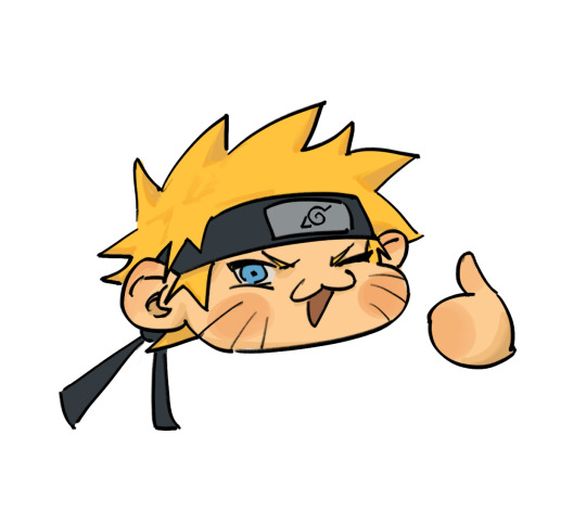
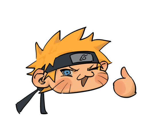
The simplified version of my process is that I paint with colours that act as the general idea of what the base colours are, and then play with curves to lower contrast + darken. I did a very quick example of what that looks like with this Naruto chibi:
This is what curve setting I use on procreate (it’ll look a little different when I do it on clip studio or photoshop, but the points remain the same. First dot is brought down a little, second dot is brought down a little, lol):
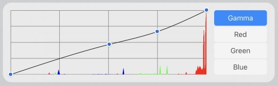
(usually I play around with curve settings a lot depending on the piece, but again the variation is based purely on what itches my brain. I just try to maintain that the curves, for me, lower contrast and darken the colours.)
For shading I will often desaturate+darken the flat colour, but I 1000% go in with a more saturated tone in between the shading and the flat colour, and over the course of painting and colour picking, it just ends up being this amalgamation of colours that work together since they are MOSTLY within an analogous range. Does that make sense?! I’m a terrible teacher, LOL!
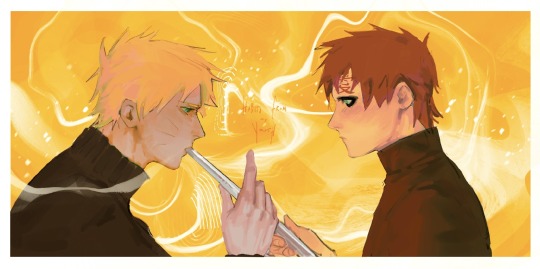
If you’re interested in slightly more details of my process, I will say that when I do have a background, that colour is usually the first thing I put down onto my canvas. I will fill in the lineart with a darker version of that colour and then start getting a basic idea of shading down before doing any colouring and rendering just to see how the general composition will feel. With the narugaa piece you mentioned, it looked like this (ignore all the white around them, this was going to be more type-heavy before I realised I hate doing text LOL):
It’s not quite just shading, but the goal is to find the values that I would be happy with seeing throughout the piece and on this hue+value of background. Also, at this point, I’m drawing with the assumption that if I were to do this completely monochromatic, the values would look like this, ya know. And then afterwards, like I depicted in the simplified version way above, I lay down flat colours. In this case, my colours were laid down on a layer that was on the “hard light” blend mode, but I think you should just do whatever blend mode gives you the colours you like best. From here, if you combine layers so that it’s a normal layer, then just playing with the curves should get you the effect that I usually work with, but this is what those base colours looked like in my case:
You can skip this part if you feel you’re good enough at colour picking, but it helped me personally with laying down colours. I did curve adjustments + new blend mode (pin light) so that I could play with complimentary colours in a way that would add some “flavour” to the drawing later. In this case it was this greenish+reddish colour for Gaara and yellowish+purple/bluish colour for Naruto (I know his skin looks more pink/red than anything but it’s significantly more cool toned, which is what I was considering for colour harmony/relationship):
I did most of the painting over these colours before using a lasso tool to pick out specific areas and change the curves to be the Actual colours of the characters, but you can mostly tell what sort of colours I maintained from the previous version vs which ones I changed. I really do think this made for more interesting visuals, but I also think it’s sort of a convoluted process that you can just do from the get go if you have a better grasp of colour theory than I do. Unfortunately I’m not knowledgeable enough about colour to get colour harmony just by picking out the colour from a wheel. This is why I love curves so much!!! Anyway, this is what it came out to:
And then I duplicate the canvas so I can merge all the layers into a single one, and then do the final curve adjustment to make everything feel cohesive. I mostly used the curve adjustments that I showed in the very beginning of this post, but because so many of the colours in this piece felt analogous, I actually valued slightly more contrast in this piece than I would want for most other pieces. Posting the final piece here for convenience:
And that’s it!!! I’m super mega sorry for how long and convoluted this probably is LOL but this is my process……. I’m certain other artists have better tutorials and I will always recommend Sinix Design on YouTube for ANY art tutorial that you might need, but if I’m being entirely honest, anything I know of colour is entirely just me consuming a lot of art over the years and going ‘oh, I like that’ or ‘oh, this is a pattern between these two artists, so it must be right’ or ‘oh, this random artist posted a tutorial and it looked good, let me glance at this and hope it somehow subconsciously sticks’ LOL. There are definitely fundamental rules that would help to know (shadows will usually be less saturated, deciding between high key vs low key composition as far as your value scale goes, what sort of emotion each colour combination/scheme evokes, the power of tints and shades) but a simple google search on basic colour theory will already explain most of this to you. Passively implementing these practices into your drawings, in my experience, helps make a lot of these rules second nature when you’re drawing. Above all though I think you should just do whatever itches your brain LOL. I have a huge reference library that I often refer to—I recommend any artist to do the same :3
#nc111 tutorials and studies#thanks again for the kind words#to be complimented on my colouring… I am floating in heaven
42 notes
·
View notes
Note
Random question, but how did you do the rainbow thing in your pinned post? Is it from something you buy on Tumblr?
the gradient, yes!!! no, it's completely free.
so, i don't remember where exactly i got the instructions as to how to do it, but this is basically how the word "welcome" from my pinned looks like in html:
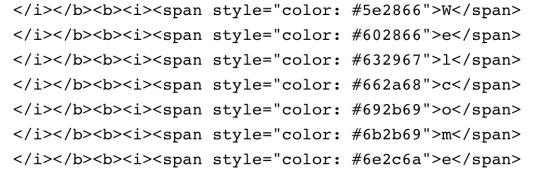
since it's a gradient, every letter is a sliiightly different hue, but i remember there was a website where you could basically write any word/sentence that you'd like gradiented, choose the starting and ending colors, and it'd automatically give you the html code for the gradiented text. i think it was this one?
and that's what you get!
you just gotta copy the code, start editing your post, make it so you're editing it as html, paste the code in, and it SHOULD work. hopefully!
#nicole answers#Anonymous#the colors work for symbols too. like hearts and arrows and stuff#i Think this is what the rainbow thing refers to??#if this is too messy i just checked and googling ''tumblr how to gradient words'' shows a few more indepth tutorials
210 notes
·
View notes
Text
twisting ft. @miodiodavinci's SALVADOR Auto Recovery

credits under the cut
original, instrumental by They Might Be Giants
UST, tuning, mix, art by @epicdogymoment
#leologisms#leography#utau#ijo Lijo#salvador auto recovery#tmbg#they might be giants#haaaaaahhh. yet another one that had to go through numerous rounds of mixing and re-mixing#so hard to get a sense for keeping vocals and bg vocals and instrumental balanced.....#the audio cover image is a quick redraw/study (?) of a very very cropped version of the flood album cover#what else is there to say. aaahhh right THIS is the thing i was doing the salvador english test (chug jug) for#ill say im definitely happy with how well i got him to articulate. but i also know all of the words to this song by heart so#im definitely biased. i like this song toooo much and doing this cover reminded me how much i like it#this is also my first time getting an utau to scream!! its very difficult to pull off. especially because the vast majority of tutorials ar#specifically for like screamo-style screams? not what im going for#anyway. thank you tmbg for the flood (1990) album and all the short songs and the official (official!!!) instrumental versions#and thank you mio for making this lovely lad. so i could force him to sing in english.#also i figured i should credit myself for ? things ? feels weird because its on my blog#but yeah i make my own usts. just think its easier to build em from scratch so theyre tailored to the vb im using and how i want to tune it#............bows really deeply.
42 notes
·
View notes
Note
how do you pick ur colors,... theyre always so bright and pretty,,,,
trying to figure out how to answer this has made me realize that the process is way more complicated than i thought it was...
It takes a lot of understanding of the values that colors have.
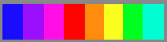
check this. All of these colors are the most saturated and bright that they come in. All from the same spot in the color box (as far top right as it goes.)
And here's how they look without the...color. They all have very different values! Blue being the darkest and yellow being the lightest. Since I'm always trying to use the most vivid colors possible this information becomes extremely important for my process.
With that in mind now, Let's take a look at Ichiya here.


Even though i used really vivid colors the values still look good! Pink makes a good midtone color so it looks nice as shading for his pale skin, but i also added some purple into it for a teensy bit of extra depth. Cyan works well as shading for whites AND as highlights for blacks! You'll also notice that the true blue rimlights on the boots are very subtle, since Blue shows up dark. THIS is the epic result of taking advantage of VALUES!
That's not the only thing that goes into the process though.
It's also important to keep in mind when to use warm or cool colors. For example, On Ichiya's hair the cyan highlights are on the blue parts since it's cool, and the bright yellows are on the purple parts. Purple is a cool color BUT it's right next to warm ones on the color wheel, making it perfectly fine to use warm highlights on.
And...just one more thing! all the vibrance comes from the rendering!! the base colors I use are quite normal, which makes the bright colors i use for shading n such pop even more in comparison.
I think I've gone over everything of note here now, I hope you don't mind the longwinded explanation😅 I just love using really vivid colors and it would be awesome to see even more people do it as well!
#liazrad answers#art tutorial#tagging that even though it's not really like. totally a tutorial. just kinda explaining what I myself do.#i think this could be helpful to other artists even if my explanation wasn't worded too eloquently.#i could in theory go more into all this but i dont want a mile long post lmao
31 notes
·
View notes
Text

@dudelymantits Fir!
#I love trans replikas#i just know he and devon would be pals i know it#dudely lemme know if i did him justice one word and this post is GONE#even though i threw the doodle at you eh#his hair was very hard i shan't lie#but he was really fun to draw i got to learn how to very badly draw welding streaks#there are NO tutorials for that btw#buuut I think i did okay? i love fir#ara#arar#ara signalis#arar signalis#signalis#signalis fanart#signalis oc#transgender#fir#jay art
25 notes
·
View notes
Text
Useful F2U Programs (and 1 F2U Website) For Writers
Can't afford Microsoft Office?? No problem, just download LibreOffice or OpenOffice, both in which are not-for-profit + open source, and you're good to go.
Need a dictionary to use when you're offline and have no internet or just need to know what something means + synonyms/antonyms?? No problem, just download WordWeb and you're good to go.
Need to create some fictitious deities for your fictitious race?? No problem, just go to Chaotic Shiny Productions, press CTRL + F, and type in Pantheon Generator Portable. Once downloaded, you're good to go.
Need to know how many words you need to write a day to reach your monthly goal of _____ number of words?? No problem, just go to Chaotic Shiny Productions, press CTRL + F, and type in NaNoWriMo Calendar. Once downloaded, you're good to go.
Want something that's better than Notepad because it auto-backups every-so-often and has a countdown word counter?? No problem, just download yEdit2 and you're good to go.
Need a program that allows you to do a scene-by-scene play for your works?? No problem, just download yWriter7 and you're good to go.
Want to be able to use ProWritingAid Pro without needing to purchase it?? No problem, just head to The ProWritingAid Team Trial Signup, get a Temporary Email (almost any of them will suffice), and create a new account every seven (7) days which will lead to an infinite number of #7DayTrails. You'll also need to download ProWritingAid and you're good to go.
Want to create your own Wikipedia?? No problem, just download this Wikipedia HTML-CSS-JS Template from HTML5 Templates, create an account on Neocities, and download Brackets to edit said Wikipedia Template. Once finished, you're good to go.
#pvposeur's tutorials#pvposeur's tutorial#pvposeur's how to#pvposeur's how tos#pvposeur's psa#pvposeur's public service announcements#pvposeur's public service announcement#writing tutorial#writing tutorials#free to use#f2u#writers on tumblr#writer on tumblr#authors on tumblr#author on tumblr#writeblr#authorblr#microsoft word#microsoft office#libreoffice#openoffice#yedit2#ywriter7#wordweb#nanowrimo#prowritingaid#brackets#wikipedia#neocities#free to reblog
27 notes
·
View notes
Text
i'm going to throw up from laughing at this
#RIGHT AWAY BOSS I'LL GET RIGHT ON THAT#i watched a Very helpful tutorial video that had it as 'eat and drink grapes' which is way easier to remember#i think bc all the words are very similar in length? that's my working theory#but this might stick in the brain for sheer. well look at it.#bass adventures#i don't expect to liveblog learning to play the bass too much but if i do that's the tag#im figuring out rhythm section want ad first :]#tmbw bass tabs sez g major tuning.... trying to figure out how to Do That.#witness me
129 notes
·
View notes
Note
how do you draw so well (I saw your ultrakill art of Gabriel and V1 fighting and it looks gorgeous) (I want to know how you give it perspective like that and overall make it look so 3d but more importantly alive)
Thank you! I try to think of a concept first before attempting anything, but sometimes that doesn't work out so I go and look for references and bg inspo. For this one tho, I just played the level over and over until I caught on to an idea that I wanted to attempt! For sure wanted to showcase their fight, but also make them stand out as much as possible(which isn't too hard with Gabriel since he's has more color than V1). Cutting things short: 1. Play with angles(above/below/etc). I put both in the air because since they have aerial abilities, it made the most sense and that kinda was my idea from the start. 2. Choose your main subject. Gabriel is the main character in the pic since he's that's being targeted, so I made sure to have V1 aim the focus towards him(the whiplash disarming him, the gun reaching out, his 'face' not showing in order to not draw focus away). 3. Use atmosphere to your advantage. The transition from enraged to normal was crucial, but I really wanted to keep the blue water and red setting somehow, so I had play around with colors for a while. I did get stuck here for a long time, but eventually the transition from his red to white armor made the most sense. The point of contact was his arm so everything around that section reverted back, thus giving me the excuse to keep the red lighting and the blue flooring. Finding reasoning like that was probably not necessary, but wanted to keep it as close to the original fight as possible lol 4. Blurring and zoom. The easiest way to make it seem more 'alive'. Just blur out the corners and slowly make way towards the main subject. Of course you're going to need to play with this since it's not as straightforward as you'd think, but there's many tutorials that explain it better! 5. Effects. My go-tos are Filter>Sharpen>Sharpen and Layer Style> Advanced Blending>Select R only and shift. Can never go wrong with these!! Hopefully this wasn't as confusing, but there's many more tutorials I've done under the tutorial tag in my blog, so hopefully this helps:'D
#asks#tutorial#I'm not as good with words I'm sorry#Demonstrations explain it better#but yeah hopefully it helps op and others reading :'D
35 notes
·
View notes
Text
thinking about my frustrations with the current system we live under and realizing my experiences (constantly having very little money, thus preventing me from buying things except once in a blue moon unless there's a free option available) are not universal. however i am charging headlong down making a mobile game, and while i probably will put ads into it bc im a broke bitch i refuse to let it be just another of the hundreds of half-assed tutorial projects with a quadspillion ads in them apiece
but this leads me to a conundrum.
i want to have cute little skins for the player character that can be "bought" through one of two things: achieving a cumulative score high enough to unlock it, or by watching a certain number of ads willingly. notably, i refuse to use the ones that interrupt the gameplay out of nowhere and do nothing except pay me, even if they technically pay app makers more than any other kind of ad.
i'm just not sure exactly how to implement it:
should the "unlock via Playing The Game" skins be completely separate from the "watch x number of ads" skins?
should the "unlock via Playing The Game" option be available on the same skins that have the "watch x number of ads" option?
should the "watch x number of ads" thing be reworked into just "watch an ad to add x amount to your current spendable score"?
should i go the scummy route and implement flat-out in-app purchases for if someone doesn't want to watch an ad to get a skin??? does anybody actually do that????? i'm too broke to comprehend the existence of that kind of person but they have to exist if half-assed apps (and tbh whole-assed apps) keep on acting like they're real
should i forfeit my dignity and integrity and do lootboxes
#rosie babbles#gamedev#like. mobile apps with in-app purchases seem to REALLY like going all 'buy ingame currency with Real Money!'#but i just refuse to do that regardless. you get to purchase the skins or what have you directly if i wind up going that route#i'm desperate not dickish#on the other hand i'm half-tossing the idea of using 'ads watched' as a 'currency' of sorts. like.#you could choose to watch a few ads in a row. then you could 'spend' one of those ads on a cosmetic. then say two days later you want a#Fancy Cosmetic that costs two ads. luckily you'd watched enough ads beforehand that you can spend more of them on the Fancy Cosmetic#like. those wouldn't 'expire' or some shit like that.#idk. i'm just very tired in multiple senses of the word#just. please believe me when i say#i'm not doing 'popular game format clone number 10 quadspillion' or 'basic-ass unity3D tutorial with ads slapped on'#if i do this thing i wanna do this thing RIGHT.#nightblogging#random polls#my polls#polls#tumblr polls
20 notes
·
View notes